
Why most local websites quietly lose the customer
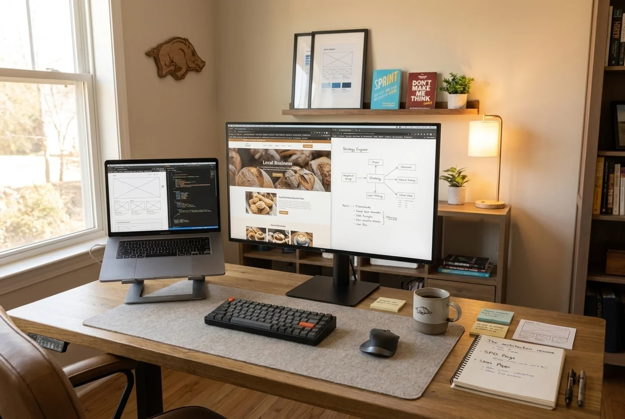
Most local websites do not fail because they look bad. They fail because they make the visitor work too hard. The person lands on the page, cannot tell what the business does in a few seconds, cannot find a reason to trust it, and cannot see an obvious next step. So they leave. No drama. No bounce-rate villain. Just a quiet exit.
If you want to capture leads from your website instead of watching them slip away, the fix usually has nothing to do with a redesign. It has to do with hesitation.
A pretty website still loses customers if the visitor cannot quickly understand the service, trust the business, and see what to do next. Lead capture is a clarity and trust problem before it is a design problem. Check your headline, your proof, and your single next step before you spend money on more traffic.
Pretty is not the same as clear
A website can look fine and still lose the buyer. Pretty does not always mean clear. Sometimes it just means the button is harder to find in a nicer font.
We see this often. The site has good photos, a clean layout, and a tidy color palette. The owner is told it looks professional, so they assume it is working. Then the phone stays quiet and nobody can explain why. That is where the fun starts, if your definition of fun is suspicious.
The visitor is not grading your design. They are asking three fast questions: What is this? Can I trust it? What do I do next? If the page cannot answer those in a few seconds, the design is decoration.
The three places buyers hesitate
1. They cannot tell what you do
Your headline is the most important sentence on the site. If it says something vague like "Solutions for your business," the visitor has learned nothing. Say the service and the place. "Local SEO and website help for Northwest Arkansas businesses" beats a clever tagline every time.
A quick test: cover everything except your top headline and first line. Could a stranger tell what you sell and who it is for? If not, that is the first leak.
2. They do not trust you yet
Trust is built with proof the visitor can see without scrolling forever. Real reviews. A real service area. Real photos of real work. A clear statement of what you actually do. If a human cannot tell what the business does in ten seconds, do not expect them to hand over their phone number.
You do not need a wall of badges. You need a few honest signals placed where the eye lands.
3. They cannot find the next step
This is the one that hurts most. The visitor is ready to act and the page makes them hunt for it. Three different buttons saying three different things. A contact form buried below the fold. A phone number in tiny gray text.
Pick one primary action and make it obvious on every screen. Book a call. Request an audit. Send a message. One clear path beats five polite options.
A simple example
Say a Rogers service business runs ads to its homepage. The page opens with a slideshow, a mission statement, and a menu of nine services. By the time the visitor figures out which service applies to them, they are gone. The ad worked. The page did not.
Now swap the order. Headline names the main service and the area. One line of proof underneath. One button that says exactly what happens next. Same business, same budget, far less hesitation. That is website conversion optimization in plain terms: remove the friction between interest and action.
Worth saying out loud: running ads to a weak page does not fix the page. Paid traffic just exposes the leak faster, and charges you for the privilege.
What to check before you redesign
- Read your headline cold. Does it name the service and the place?
- Find your proof. Is there visible trust above the fold, or just a logo?
- Count your calls to action. More than one primary action usually means none of them are clear.
- Test on a phone. Most local visitors are on mobile, and a desktop-only layout hides the button.
- Time the next step. From landing to "I know what to do," how many seconds and how many clicks?
If those five checks turn up problems, you have a clarity issue, not a design issue. A new template will just repaint the same confusion.
When you probably do not need us
If your site already states the service plainly, shows real proof, and has one obvious next step, and the calls still are not coming, the problem may be upstream. You might have a visibility gap, not a conversion gap. In that case the website is fine and the work belongs in local SEO for small businesses, not a page rebuild. The point is to fix the real leak, not the convenient one.
Not sure where the leak is?
Most lead problems need a diagnosis before they need more traffic. A Local Authority Audit looks at your website, profile, reviews, and search visibility together, then tells you what is helping, what is weak, and what to fix first.
Send a message and ask what to fix first.